Hero images can be used in versatile ways. Home pages and landing pages are the most frequent use cases but they also work well with single post, archive, contact, and other pages. Although hero sections vary by size, full page hero images have become very fashionable in recent years, used by many notable publishers such as Medium.com.
However, creating a full page hero image is not an easy task, as you need to pay attention to many things such as:
- The hero image needs to cover the whole viewport size—not less and not more.
- The content on top of the hero image needs to be centered.
- The hero text needs to be highly visible which, in most cases, requires some kind of filter.
- The hero image needs to look good on all screen sizes.
In this tutorial, we will create a full page hero image that solves all these problems. This is how the end result will look like:

Let’s get started by setting up the HTML.
1. Set up the HTML
Create two containers for the hero section and the hero content: .hero and .hero-content in the example below. The purpose of the two containers is that later you can use flexbox to center the content both vertically and horizontally by making the .hero element a flex container.
<section class="hero">
<div class="hero-content">
<h1 class="hero-title">
Discover the World
</h1>
<h2 class="hero-subtitle">
We offer the best adventure holidays and tailor-made trips!
</h2>
<button type="button" class="hero-button" onclick="location.href='tours.html'">
Search for tours »
</button>
</div>
</section>For the call to action button, use the semantic <button> element to make the hero section more accessible. Add the link destination to the onclick event to make the entire button clickable.
You could also use an <a> tag inside <button> but in that case, only the text link will be clickable. This is because the dimensions (width, height) and display property of elements inside the <button> tag can’t be changed (this is a specific feature of <button>).
2. Add the background image
Add the hero image as the background of the ::before pseudo-element of the .hero section. In this way, you can add a brightness filter only to the background image so that the white text on top of it will have sufficient color contrast. If you add the filter right to the .hero element it will be also applied to the hero text and button (not just to the background image), which would defeat the goal.
To make the background span across the whole viewport size both vertically and horizontally, set the .hero element’s width to 100vw (viewport width) and height to 100vh (viewport height). You can learn more about viewport units in our previous article written by Sara Vieira.
body {
    margin: 0;
    padding: 0;
}
.hero {
    position: relative;
    width: 100vw;
    height: 100vh;
}
.hero::before {
    content: "";
    position: absolute;
    top: 0;
    left: 0;
    width: 100%;
    height: 100%;
    background: url(images/forest.jpg);
    background-repeat: no-repeat;
    background-size: cover;
    background-position: center center;
    filter: brightness(60%);
}
.hero-content {
    position: relative;
}
To display the .hero::before pseudo-element above .hero but below .hero-content across the z-axis, set the position of .hero and .hero-content to relative, and the position of .hero::before to absolute, too.
3. Center the content with flexbox
To center the content within the hero section, make the .hero element a flex container by adding the display: flex; property to it. Hence, .hero-content will be the flex item and you can easily position it using the justify-content and the align-items properties.
As flex-direction is row (you use the default value, so there’s no need to add it separately), justify-content aligns items horizontally, while align-items aligns them vertically. To make a perfectly positioned inner content, set the values of both to center.
.hero {
    position: relative;
    width: 100vw;
    height: 100vh;
    display: flex;
    justify-content: center;
    align-items: center;
}
4. Style the hero text
The last thing you need to do to perfectly center the text on top of the hero image is adding the text-align: center rule to the .hero-content element.
Now, that everything is properly displayed and positioned, you only need to add styles to the hero text and button. For the demo, we have used the Monserrat typeface by Julieta Ulanovsky but you can use any other fonts, including variable fonts that look especially good on landing pages and hero sections.
.hero-content {
    position: relative;
    font-family: "Monserrat", sans-serif;
    color: white;
    text-align: center;
    margin: 0.625rem;
}
.hero-title {
    font-size: 3rem;
    font-weight: 600;
    margin-bottom: 0;
}
.hero-subtitle {
    font-size: 2rem;
    font-weight: 200;
    margin-top: 1rem;
}
To avoid collapsing margins, add the margin-bottom: 0; rule to the .hero-title element, then add the full distance you want to have between the title and subtitle (1rem in the example) as the margin-top value of .hero-subtitle. Otherwise, the user’s browser will collapse the top and bottom margins of the title and subtitle, as they are two adjacent sibling elements.
5. Style the hero button
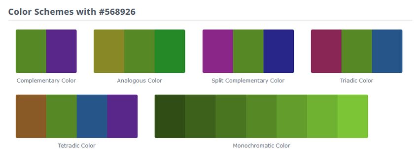
For the call to action button, choose a background color that has a high color contrast with the main color of the hero image. The easiest way to do that is by using a tool that extracts color schemes from images, such as Palette Generator.

Then, pick the most vibrant dominant color (for instance, the lighter green on the image above) and find its complementary and triadic colors using a color analysis tool such as ColorHexa.
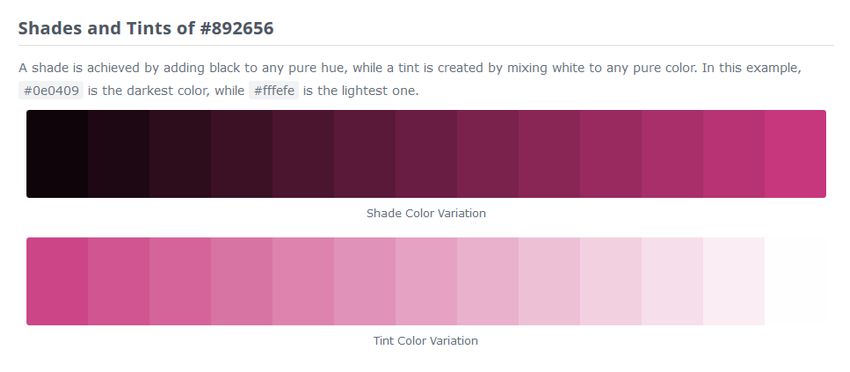
Choose the one you like the most and generate its shades and tints still with ColorHexa or your color tool of choice. Pick the one that works best with your hero image (in the example, we have used a nice medium magenta from the middle of the color variation sequence below). You can use other tints and shades of the same color for border and hover colors.
To make the <button> element look like a button, also change the value of the cursor property to pointer. As <button> doesn’t inherit the fonts of its parent element, you need to define the font-family property again if you want to use the same fonts for the hero button, too.
.hero-button {
    background-color: #ae2d59;
    color: white;
    border: 1px solid #cb376a;
    margin-top: 5rem;
    padding: 0.9375rem 1.875rem;
    font-family: "Monserrat", sans-serif;
    font-size: 1.125rem;
    font-weight: 200;
    cursor: pointer;
}
.hero-button:hover {
    background-color: #cb376a;
    border: 1px solid #db7598;
}
6. Test the hero section on different viewport sizes
And, your full-page hero section is done! To make it work for all users, don’t forget to test it on different viewport sizes. You can either resize your browser window manually or use the Responsive Design Mode of your browser’s Developer Tools (see on the image below how it works with Firefox).

Check if all margins, paddings, font sizes, and other dimensions look good on all viewport sizes and fix the CSS if you find any discrepancies. Also check if the hero image precisely covers the entire viewport size.
The entire CSS file
To put the code together, here is the entire CSS of creating a full-page hero image:
body {
   margin: 0;
   padding: 0;
}
.hero {
   position: relative;
   width: 100vw;
   height: 100vh;
   display: flex;
   justify-content: center;
   align-items: center;
}
.hero::before {
   content: "";
   position: absolute;
   top: 0;
   left: 0;
   width: 100%;
   height: 100%;
   background: url(images/forest.jpg);
   background-repeat: no-repeat;
   background-size: cover;
   background-position: center center;
   filter: brightness(60%);
}
.hero-content {
   position: relative;
   font-family: "Monserrat", sans-serif;
   color: white;
   text-align: center;
   margin: 0.625rem;
}
.hero-title {
   font-size: 3rem;
   font-weight: 600;
   margin-bottom: 0;
}
.hero-subtitle {
   font-size: 2rem;
   font-weight: 200;
   margin-top: 1rem;
}
.hero-button {
   background-color: #ae2d59;
   color: white;
   border: 1px solid #cb376a;
   margin-top: 5rem;
   padding: 0.9375rem1.875rem;
   font-family: "Monserrat", sans-serif;
   font-size: 1.125rem;
   font-weight: 200;
   cursor: pointer;
}
.hero-button:hover {
   background-color: #cb376a;
   border: 1px solid #db7598;
}
Conclusion
At the beginning of the tutorial, we have posed four challenges of creating a full page hero image. Now, let’s summarize the techniques we have used to solve them:
- The vw and vh units ensure that the hero image covers the entire viewport size.
- Flexbox and the text-align property center the content on top of the hero image.
- The ::before pseudo-element and absolute positioning make it possible to apply the brightness filter only to the background image (but not to the content shown on top of it). In this way, we can darken the hero image to provide the white hero text with sufficient color contrast and make it easy to read.
- The relative units (rem) and adjusted margins make it sure that the hero image looks good on all viewport sizes.
That’s all. If you have enjoyed this tutorial, have a look at our similar step-by-step guide of how to create a landing page with Bootstrap 4, too.