In this tutorial we will be creating a login form using only CSS3 and HTML5, we will be recreating Orman Clark’s Elegant Login Form.
We will create this login form in three separate steps, the first step will deal with the HTML Markup, while the second step will focus on the positioning of the elements, finally the third step will focus the styling of the different elements. Next week we will show you how to add a sign up page to your login form so be sure to check back.
Step 1: The HTML Markup
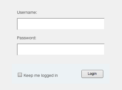
The first thing we will add is the HTML part, this part will create the actual login form, and will consist of a container, a form as well as some inputs.
<div id="container">
<form>
<label for="username">Username:</label>
<input type="text" id="username" name="username">
<label for="password">Password:</label>
<input type="password" id="password" name="password">
<div id="lower">
<input type="checkbox"><label for="checkbox">Keep me logged in</label>
<input type="submit" value="Login">
</div><!--/ lower-->
</form>
</div>
If you entered the code above correctly then your login form should now look like this:
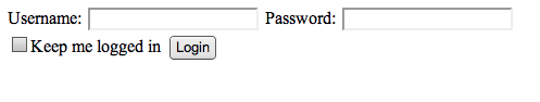
So now that we have gotten this far let’s start styling the different input areas, we will do that by adding the following code:
/* Basics */
html, body {
 width: 100%;
height: 100%;
font-family: "Helvetica Neue", Helvetica, sans-serif;
color: #444;
-webkit-font-smoothing: antialiased;    background: #f0f0f0;
}
If you added this correctly your login form should now look like this:
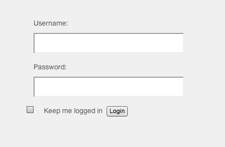
Step 2: Positioning the Elements
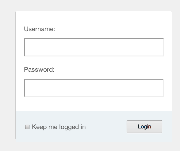
Now that we have our actual login form created let us start with the styling of the form, the first thing we will do is specify the basics such as font color and so forth, then we will position our login form in the center of the page.
#container {
position: fixed;
width: 340px;
height: 280px;
top: 50%;
left: 50%;
margin-top: -140px;
margin-left: -170px;
}
If you did this correct your form should now look like this:
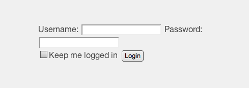
You must agree that this does look a little wonky, therefore we are going to add some structural style to our login form, first we will make sure everything isn’t squashed together on the first line, we will do this by adding the following code:
form {
    margin: 0 auto;
    margin-top: 20px;
}
label {
    color: #555;
    display: inline-block;
    margin-left: 18px;
    padding-top: 10px;
    font-size: 14px;
}
If you entered the code above correctly then your login form should now look like this:
So now that we have gotten this far let’s start styling the different input areas, we will do that by adding the following code:
p a {
    font-size: 11px;
    color: #aaa;
    float: right;
    margin-top: -13px;
    margin-right: 20px;
}
p a:hover {
    color: #555;
}
input {
    font-family: "Helvetica Neue", Helvetica, sans-serif;
    font-size: 12px;
    outline: none;
}
input[type=text],
input[type=password] {
    color: #777;
    padding-left: 10px;
    margin: 10px;
    margin-top: 12px;
    margin-left: 18px;
    width: 290px;
    height: 35px;
}
If you entered the code correctly you should immediately see the difference, your login form should now look like this:
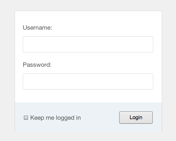
Finally lets make the bottom look a little more stylish, we will do that by adding the following code:
#lower {
    background: #ecf2f5;
    width: 100%;
    height: 69px;
    margin-top: 20px;
}
input[type=checkbox] {
    margin-left: 20px;
    margin-top: 30px;
}
.check {
    margin-left: 3px;
}
input[type=submit] {
    float: right;
    margin-right: 20px;
    margin-top: 20px;
    width: 80px;
    height: 30px;
}
Now if you did everything correctly your login form should look like this:
Step 3: Styling the elements
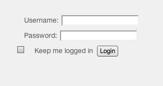
Now that we have positioned the elements as we wanted it is time to make them more beautiful. We will do this by giving the container rounded corners and a box shadow for depth. Remember since we are going to style the container you need to add the code to that area, the code you need to enter for this is the following:
background: #fff;
    border-radius: 3px;
    border: 1px solid #ccc;
    box-shadow: 0 1px 2px rgba(0, 0, 0, .1);
Your whole container should now look like this:
#container {
    position: fixed;
    width: 340px;
    height: 280px;
    top: 50%;
    left: 50%;
    margin-top: -140px;
    margin-left: -170px;
	background: #fff;
    border-radius: 3px;
    border: 1px solid #ccc;
    box-shadow: 0 1px 2px rgba(0, 0, 0, .1);
If you did everything correct your login form should now look like this:
The next thing we will do is add a similar rounded look to the inputs, we will add the following code to the password
border: 1px solid #c7d0d2;
    border-radius: 2px;
    box-shadow: inset 0 1.5px 3px rgba(190, 190, 190, .4), 0 0 0 5px #f5f7f8;
}
So the whole input password code should look like this:
input[type=password] {
color: #777;
padding-left: 10px;
margin: 10px;
margin-top: 12px;
margin-left: 18px;
width: 290px;
height: 35px;
border: 1px solid #c7d0d2;
border-radius: 2px;
box-shadow: inset 0 1.5px 3px rgba(190, 190, 190, .4), 0 0 0 5px #f5f7f8;
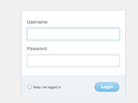
}If you did that correct you should now see the following:
As you can see in the image above this little bit of code stylized the whole input field.
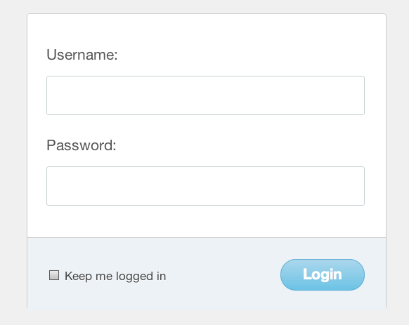
The next thing we are going to do is to make the login button look much nicer, we will do this by adding the following code to the submit section:
font-size: 14px;
    font-weight: bold;
    color: #fff;
    background-color: #acd6ef; /*IE fallback*/
    background-image: -webkit-gradient(linear, left top, left bottom, from(#acd6ef), to(#6ec2e8));
    background-image: -moz-linear-gradient(top left 90deg, #acd6ef 0%, #6ec2e8 100%);
    background-image: linear-gradient(top left 90deg, #acd6ef 0%, #6ec2e8 100%);
    border-radius: 30px;
    border: 1px solid #66add6;
    box-shadow: 0 1px 2px rgba(0, 0, 0, .3), inset 0 1px 0 rgba(255, 255, 255, .5);
    cursor: pointer;
}
Now the whole code for this area should look like this:
input[type=submit] {
    float: right;
    margin-right: 20px;
    margin-top: 20px;
    width: 80px;
    height: 30px;
    font-size: 14px;
    font-weight: bold;
    color: #fff;
    background-color: #acd6ef; /*IE fallback*/
    background-image: -webkit-gradient(linear, left top, left bottom, from(#acd6ef), to(#6ec2e8));
    background-image: -moz-linear-gradient(top left 90deg, #acd6ef 0%, #6ec2e8 100%);
    background-image: linear-gradient(top left 90deg, #acd6ef 0%, #6ec2e8 100%);
    border-radius: 30px;
    border: 1px solid #66add6;
    box-shadow: 0 1px 2px rgba(0, 0, 0, .3), inset 0 1px 0 rgba(255, 255, 255, .5);
    cursor: pointer;
}
If you do everything correctly then so far this is what your login form should look like:
Next, to aid user feedback, we could do with some hover and active states, we need to add the following text to the p a { area:
  -webkit-transition: all .4s ease;
    -moz-transition: all .4s ease;
    transition: all .4s ease;
}
Now the whole code for that area should read:
p a {
    font-size: 11px;
    color: #aaa;
    float: right;
    margin-top: -13px;
    margin-right: 20px;
    -webkit-transition: all .4s ease;
    -moz-transition: all .4s ease;
    transition: all .4s ease;
The input password area needs the following
box-shadow: inset 0 1.5px 3px rgba(190, 190, 190, .4), 0 0 0 5px #f5f7f8;
    -webkit-transition: all .4s ease;
    -moz-transition: all .4s ease;
    transition: all .4s ease;
}
input[type=text]:hover,
input[type=password]:hover {
    border: 1px solid #b6bfc0;
    box-shadow: inset 0 1.5px 3px rgba(190, 190, 190, .7), 0 0 0 5px #f5f7f8;
}
input[type=text]:focus,
input[type=password]:focus {
    border: 1px solid #a8c9e4;
    box-shadow: inset 0 1.5px 3px rgba(190, 190, 190, .4), 0 0 0 5px #e6f2f9;
}
And finally at the bottom of the text you need to insert the following code:
input[type=submit]:hover {
    background-image: -webkit-gradient(linear, left top, left bottom, from(#b6e2ff), to(#6ec2e8));
    background-image: -moz-linear-gradient(top left 90deg, #b6e2ff 0%, #6ec2e8 100%);
    background-image: linear-gradient(top left 90deg, #b6e2ff 0%, #6ec2e8 100%);
}
input[type=submit]:active {
    background-image: -webkit-gradient(linear, left top, left bottom, from(#6ec2e8), to(#b6e2ff));
    background-image: -moz-linear-gradient(top left 90deg, #6ec2e8 0%, #b6e2ff 100%);
    background-image: linear-gradient(top left 90deg, #6ec2e8 0%, #b6e2ff 100%);
}
This should result in the following:
That’s it for now, below you can find the demo as well as download the source! Next week we will show you how to add a signup page to your login form.

