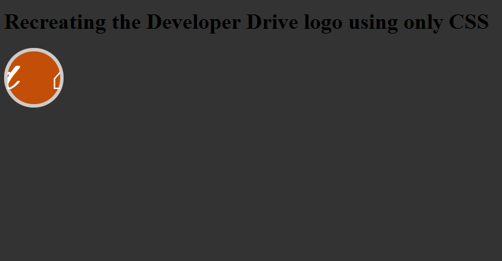
I quite like the developer drive logo animation. I remember seeing it a when I first found the site and thought it was simple, yet effective. I also wondered if it would be possible to replicate it using just CSS.
In this snippet we’ll cover CSS3 transitions and using @font-face to import some custom fonts.
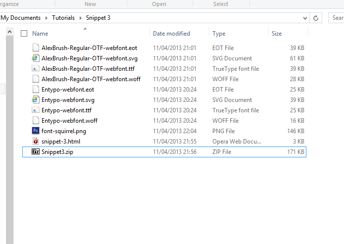
The first thing we need to do is import out fonts, I wasn’t sure what the current ‘d’ font is so I have a similar font. The best place to go is www.fontsquirrel.com, you can pick from a wide selection of fonts or upload your own if you have a valid license. Once you’ve picked your font, in this case Alex Brush simply click on “Webfont Kit” and “Download @font-face kit”. You’ll be served a zip file containing the required font files, a sample css and html file. Extract them to your html folder and add the css @font-face to your own css file.
I also used Entypo for the house icon (which renders differently per browser for some reason)
@font-face {
    font-family: 'AlexBrushRegular';
    src: url('AlexBrush-Regular-OTF-webfont.eot');
    src: url('AlexBrush-Regular-OTF-webfont.eot?#iefix') format('embedded-opentype'),
         url('AlexBrush-Regular-OTF-webfont.woff') format('woff'),
         url('AlexBrush-Regular-OTF-webfont.ttf') format('truetype'),
         url('AlexBrush-Regular-OTF-webfont.svg#AlexBrushRegular') format('svg');
    font-weight: normal;
    font-style: normal;
}

@font-face {
    font-family: 'EntypoRegular';
    src: url('Entypo-webfont.eot');
    src: url('Entypo-webfont.eot?#iefix') format('embedded-opentype'),
         url('Entypo-webfont.woff') format('woff'),
         url('Entypo-webfont.ttf') format('truetype'),
         url('Entypo-webfont.svg#EntypoRegular') format('svg');
    font-weight: normal;
    font-style: normal;
}
Next up we’ll need our HTML, it’s actually quiet small.
<div class="logo">
    <a href="#"><div class="wrapper"><span class="d">d</span><span class="home">⌂</span></div></a>
</div>
Now we can start on the CSS properly. First up, let’s use our fonts! In the HTML above you can see I wrapped each character in it’s own <span> tag, that means I can apply the two separate fonts as I need. I’ll need to remove and text decoration from the <a> tag, I’ve also added a margin-right to space out the two characters.
span {
    color: #ffffff;
    margin-right: 50px;
}

span.d {
    font-family: 'AlexBrushRegular';
    font-size: 70px;
    font-weight: bold;
}

span.home {
    font-family: 'EntypoRegular';
    font-size: 50px;
}

a, a:hover, a:active {
    text-decoration: none;
}
Now that’s done, I’ll have to show only one character at a time. I’ll do that by specifying a width and height on the <a> tag and then hiding it’s overflow. I’m also going to force it’s position property to relative, as I’ll be positioning the wrapper div absolutely in a minute.
div.logo a{
    width: 77px;
    height: 77px;
    position: relative;
    overflow: hidden;
}
As you can see the ‘d’ is not in the right position, so I’m going to force it’s parent <div> (wrapper) to be positioned absolute and set it’s top and left values. I’m also going to add our CSS3 transition here.
div.wrapper {
    position: absolute;
    top: -2px;
    left: 18px;
    padding: 2px;

    transition: all 0.5s ease-in-out;
    -webkit-transition: all 0.5s ease-in-out;
    -moz-transition: all 0.5s ease-in-out;
    -ms-transition: all 0.5s ease-in-out;
    -o-transition: all 0.5s ease-in-out;
    transform: translate3d(0,0,0);
    -o-transform: translate3d(0,0,0);
    -ms-transform: translate3d(0,0,0);
    -webkit-transform: translate3d(0,0,0);
}
*note I’ve added the transform property here as a fix, as some users where reporting an artifact issue on the animation. This seems to have fixed the problem for them.
Now I need to provide a CSS selector, to start the animation on hover and move the ‘d’ to the left and bring the house into focus.
div.logo a:hover div.wrapper {
    top: -2px;
    left: -65px;
}
So now I have the sliding animation I need, but the Developer Drive logo is a circle with a light grey border. Once again it’s CSS to the rescue! By adding a border-radius and setting the border values I can turn the <a> tag in to a circle, all I need to do then is change it’s display value to block.
div.logo a{
    width: 77px;
    height: 77px;
    position: relative;
    overflow: hidden;

    display: block;
    background-color: #c24e07;

    border: 5px solid #cccccc;

    border-radius: 100%;
    -moz-border-radius: 100%;
    -webkit-border-radius: 100%;
}
And there you have it! No images and no JavaScript, just custom fonts and CSS.

