The default WordPress theme (TwentyTwelve) comes with a pretty standard previous/next post function for the theme. I don’t particularly like the links as they feel a little forgotten about and they could easily be so much more. This snippet will show you how to create a custom navigation function and we’ll be using Font Awesome to add some icons.
Adding Font Awesome
Font Awesome is quite literally awesome. It’s a collection of over 360 icons presented as a font. This means you can easily add it to any web site or web application. The result is a cross-browser, scalable icon library. You can download it here for free.
Just grab the font folder and upload it to your theme directory. To actually include it in our theme all you need to do is use @font-face to specify the path to the required font files. Depending on your folder structure it should look something like this.
@font-face {
  font-family: 'FontAwesome';
  src: url('./font/fontawesome-webfont.eot?v=3.2.1');
  src: url('./font/fontawesome-webfont.eot?#iefix&v=3.2.1') format('embedded-opentype'),
    url('./font/fontawesome-webfont.woff?v=3.2.1') format('woff'),
    url('./font/fontawesome-webfont.ttf?v=3.2.1') format('truetype'),
    url('./font/fontawesome-webfont.svg#fontawesomeregular?v=3.2.1') format('svg');
  font-weight: normal;
  font-style: normal;
}
Don’t forget to update the path if you need to!
Creating and registering our function
Our function will need access to the global $wp_query variable. It needs this to determine if the current query has more than one page. If the query does have more than one page, we’re simply going to output a nav element and call the next_posts_link and previous_posts_link functions. These functions take two parameters, but we’re only interested in the first. This parameter is the label value that we want to display. Here I’m specifying two encoded values (& #xf053; and & #xf054;) these represent the left and right chevron symbols in Font Awesome. Next we’re going to use the wp_footer action to register our function.
if ( ! function_exists( 'theme_content_navigation' ) ) {
function theme_content_navigation( ) {
global $wp_query;
if ( $wp_query->max_num_pages > 1 ) { ?>
<nav class="navigation" role="navigation">
<div class="nav-previous"><?php next_posts_link( '' ); ?></div>
<div class="nav-next"><?php previous_posts_link( '' ); ?></div>
</nav>
<?php
}
}
}
add_action('wp_footer', 'theme_content_navigation');
Styling our navigation elements
Most themes these days seem to be in or around 960px wide, certainly far less then most monitors these days. That leaves lots of space to the left and right of the page. I’m going to take advantage of the space and position the two buttons either side of the main content. To do this, I set their position to fixed and set their top value to 50% (half way down the screen). Then for the previous button (left side), I set it’s left value to 10% and for the next button I specify its right value to 10%. You may want to adjust these to different values using @media selectors for a more responsive design, but in general using percentages works quite well. I’m also going to force a fixed width and height on the div elements, this allows me to specify a border radius effect and turn them in to disc (circles). The border radius should be 50% of the height/width to create this effect. We should also specify our font family at this point.
div.nav-previous, div.nav-next {
    clear: both;
    width: 50px;
    height: 50px;
    position: fixed;
    bottom: 50%;
    font-family: "FontAwesome";
    font-style: normal;
    font-weight: 400;
    font-size: 40px;
    background-color: #333333;
    -webkit-border-radius: 25px;
    -moz-border-radius: 25px;
    border-radius: 25px;
}

div.nav-previous {
    left: 10%;
}

div.nav-next {
    right: 10%;
}

div.nav-previous a, div.nav-next a {
    color: #ffffff;
    text-decoration: none;
    display: block;
    text-align: center;
    line-height: 50px;
}
To actually center the icons, I’m using a little hack that involves setting the line-height to the element the same size as the font and then using text-align to center it.
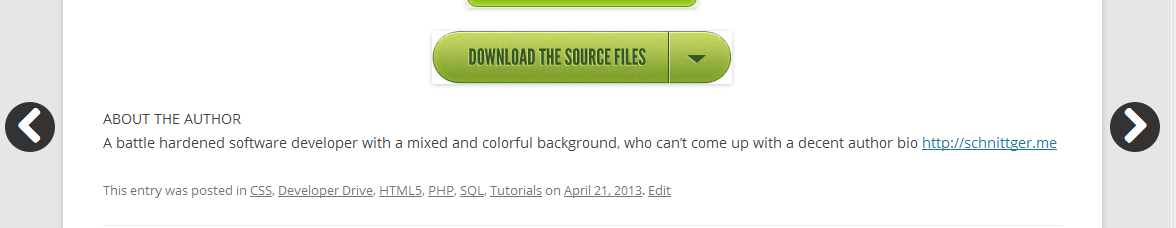
Now we have easily recognizable buttons, the scroll along with the user so they are always accessible. There are plenty of other directional icons in Font Awesome for you to play with. You can see them all here