CSS-in-JavaScript libraries have become increasingly popular in recent years. They allow you to write component-level CSS using JavaScript. CSS-in-JS libraries are ideal for larger-scale projects when you create single-page applications built of multiple components. Although CSS-in-JS libraries certainly have a learning curve, they also come with many benefits, such as:
- You don’t have to maintain multiple CSS files, as styles are encapsulated within their own component.
- JavaScript enhances the capabilities of CSS (e.g. nesting, automatic vendor-prefixing, unit testing—depending on the library).
- Selectors are locally scoped, as CSS-in-JS libraries generate unique class names so that you don’t have to worry about specificity collision.
- You can achieve better performance, as CSS-in-JS only loads styles that are currently in use.
In this article, we’ll have a look at the most popular CSS-in-JS libraries currently on the market.
1. Styled Components
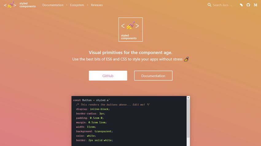
Styled Components is probably the first name that comes to mind when speaking of CSS-in-JS libraries. It’s being used by several notable companies such as BBC, Reddit, Vimeo, Lego, and many others. Styled Components lets you define the CSS styles of your components using ES6 template literals. It’s compatible with both the React and React Native frameworks.
Besides all features of the CSS language, Styled Components also allows you to nest your CSS selectors, as you would do it with Sass. Styled Components generates a unique class name for each component. For instance, the following example from Styled Components’ GitHub docs styles the <Title> and <Wrapper> React components:
import React from 'react';
import styled from 'styled-components';

const Title = styled.h1`
  font-size: 1.5em;
  text-align: center;
  color: palevioletred;
`;

const Wrapper = styled.section`
  padding: 4em;
  background: papayawhip;
`;

<Wrapper>
  <Title>Hello World, this is my first styled component!</Title>
</Wrapper>
2. JSS
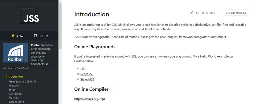
JSS is a framework-agnostic CSS-in-JS library with which you can dynamically generate CSS styles based on the state of your components. It’s a pretty flexible tool, as it can compile in the browser, on the server, or at build time using Node.js. The core library is just 6 KBytes gzipped and minified, however you can extend it with a couple of plugins, too.
Although you can use JSS with any framework, it has ready-made integrations for React called React-JSS and Styled Components called Styled-JSS. You can also try it out live inside the Core JSS playground. JSS’ syntax is very similar to CSS’ and the authors also provide helpful how-to guides and sample apps that can help you get started.
The following example creates an H1 title component with orangered background and bold, white fonts:
import jss from 'jss'

const styles = {
   wrapper: {
      padding: 40,
      background: 'orangered',
      textAlign: 'center'
   },
   title: {
      font: {
          size: 40,
          weight: 900
      },
      color: 'white'
   }
}

const { classes } = jss.createStyleSheet(styles).attach()

document.body.innerHTML = `
   <div class="${classes.wrapper}">
      <h1 class="${classes.title}">Title</h1>
   </div>
`
3. Emotion

Emotion is a framework-agnostic CSS-in-JS library that comes with many advanced features such as source maps, a cache provider, and snapshot tests. Its syntax is as close to CSS as possible to make the adoption easier. You can write your Emotion scripts using either ES6 template literals or JavaScript objects.
The core Emotion library is pretty small, only 2.3 kBytes, however you can extend it with additional packages. For example, you can add support for React apps or use the library together with ESLint.
Here’s a simple example from the docs that changes the color of a text link on hover:
import { css, cx } from 'emotion'
const color = 'white'
render (
   <div className={css`
              padding: 32px;
              background-color: hotpink;
              font-size: 24px;
              border-radius: 4px;
              &:hover {
                   color: ${color};
              }
   `}>Hover to change color.</div>
)
4. Aphrodite
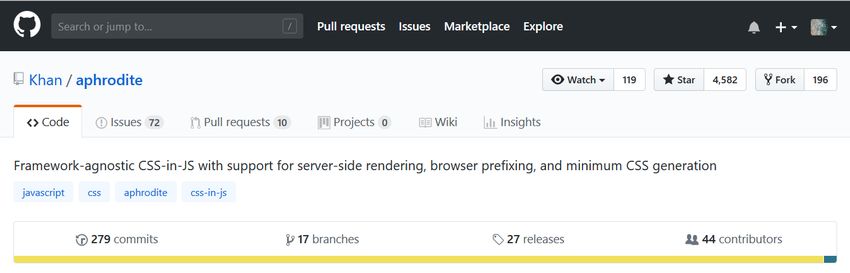
Aphrodite has been created by Khan Academy, one of the most popular e-learning platforms for programmers. Khan Academy’s engineers initially built it to improve their own React UI’s page load times but later open-sourced the project. Although Aphrodite was developed with React in mind, it’s a framework-agnostic CSS-in-JS library. So, you can use it with any other frameworks or simply with Web Components.
It’s a relatively lightweight library being 6 kBytes in size (gzipped and minified). Aphrodite supports server-side rendering and minimum CSS generation to improve your components’ rendering time. You can also make use of features like automatic @font-face detection and insertion, pseudo-selector support, and built-in auto-prefixing. When you specify multiple styles within a component, Aphrodite respects precedence order just like regular CSS.
Here’s a code example from Aphrodite’s GitHub docs when the library is being used with Web Components (without React). It simply adds a red background to your application.
import { StyleSheet, css } from 'aphrodite';

const styles = StyleSheet.create({
   red: {
      backgroundColor: 'red'
   }
});

class App extends HTMLElement {
   attachedCallback() {
       this.innerHTML = `
           <div class="${css(styles.red)}">
               This is red.
           </div>
       `;
   }
}

document.registerElement('my-app', App);
5. Radium
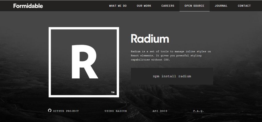
Radium uses a different approach to writing CSS in JavaScript. Instead of generating a unique class name for each component, it adds inline styles right to the HTML. So, each HTML element is directly styled with the style global attribute. Inline styles have a couple of benefits such as source order independence, dead code elimination, and specificity conflict prevention.
You can use Radium only with the React framework. As it was created specifically for React, it provides you with prop-based rendering, so you can style your React components based on their state. Radium has some advanced features as well, such as automatic vendor prefixing, a keyframe animation helper, and ES6 class support.
The example below is from Radium’s documentation. It creates a Button component with three different styles: primary, warning, and disabled.
<Button
   kind="primary"
   disabled={false}
   styles={{
      base: {
          padding: "1.5em 2em",
          border: "0px",
          cursor: "pointer",
          fontSize: "1rem",
          fontWeight: 700,
      },
      primary: {
          backgroundColor: "#0074D9",
          color: "#ffffff",
          ":hover": {
              backgroundColor: color("#0074d9").lighten(0.2).hexString()
          }
      },
      warning: {
          backgroundColor: "#F5A623",
          color: "#ffffff",
          ":hover": {
              backgroundColor: color("#F5A623").darken(0.2).hexString()
          }
      },
      disabled: {
          opacity: .4,
          cursor: "not-allowed"
      }
}}
>
Radium Button
</Button>
6. Styletron

Styletron is a framework-agnostic CSS-in-JS library that lets you define CSS styles using JavaScript objects. You can use Styletron together with plain JavaScript, React, or any other frameworks. It also has an implementation for Atomic CSS, a popular CSS methodology created for component-based styling. Components styled with Styletron are portable across different rendering engines.
The Styletron library optimizes critical rendering paths, which means it only processes CSS rules that are currently in use. This feature eliminates all redundancies and leads to faster page load times. You don’t need any extra tooling such as Babel plugins or Webpack loaders to use Styletron. You only have to add an additional npm module to your project and you are good to go.
The code example below uses the Styleton-React implementation to create styles for the <a> tag.
import { styled } from "styletron-react";

export default () => {
  const Anchor = styled("a", {
    fontSize: "20px",
    color: "red"
  });

  return <Anchor href="/getting-started">Start!</Anchor>;
};
7. Styled-JSX
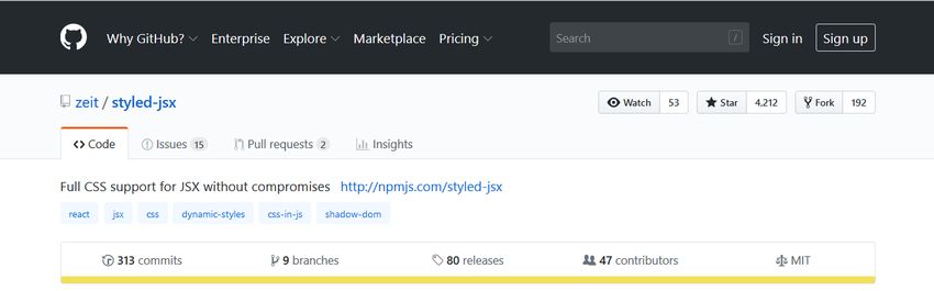
Styled-JSX is a CSS-in-JS library that adds full CSS support for the JSX syntax. JSX is one of the ways you can create React components; it adds XML syntax such as tag names and attributes to JavaScript. You can render Styled-JSX both on the client- and server side. With Styled-JSX, you can add CSS styles to JSX by means of ES6 template literals.
The runtime size of the library is just 3 kBytes when it’s gzipped and minified. It supports all CSS features, plus lets you perform CSS pre-processing via plugins. Styled-JSX comes with built-in vendor prefixing, source map and dynamic style support, and complete code isolation, too.
The code example below is from Styled-JSX’s GitHub docs. It changes the color of the .jsx-123 paragraph to red.
import _JSXStyle from 'styled-jsx/style'
export default () => (
  <div className="jsx-123">
    <p className="jsx-123">Only this paragraph will get the style.</p>
    <_JSXStyle id="123">{`p.jsx-123 {color: red;}`}</_JSXStyle>
  </div>
)
Conclusion
You probably won’t need a CSS-in-JS library for a smaller project. However, it can definitely improve your front-end workflow when you are building a component-based application. Components styled with a CSS-in-JS library are portable, load fast, and don’t bump into specificity issues.
To learn more about how to create single-page applications, check out our recent collection of the most interesting JavaScript frameworks, too.