Enabling dark mode in CSS allows website visitors to switch to an eye-friendly and resource-saving design whenever they want. There are a couple of UX patterns you can use to add a dark theme to your site. In this tutorial, we will show you how to add a simple jQuery toggle to the top of the page so that users can easily switch dark mode on and off.
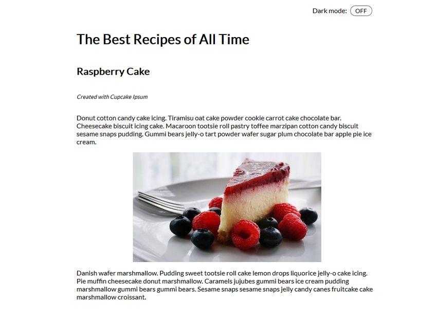
Our demo will be responsive as well, so it will look good on all device sizes, from smartphones to desktops to large screens. Here is how the light mode will finally look like:
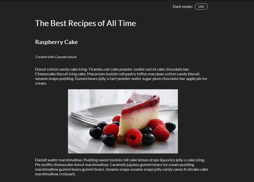
And, here is the dark mode version of the same page:
So, let’s get started by setting up the file structure for the belonging HTML, CSS, and JavaScript files.
1. Create the File Structure
Create a folder and place three empty text files inside of it: one with .html, one with .css, and one with .js extension. Also create an images folder for the image(s) you want to display on the page.
Our “dark mode in CSS” demo also makes use of jQuery. In the example, we’ll add the script to the HTML file right from the Cloudflare CDN so that it will always be up-to-date. However, if you want you can also download the jQuery library and add it as a local .js file.
Here’s how your file structure should look like before getting started with the code:
- dark-mode-css/
      - images/
            - cake.jpg
      - index.html
      - script.js
      - style.css
2. Mark Up the HTML
In the HTML, add the dark mode switch to the top of the page. Then, create a <h1> tag for the title and a semantic <article> tag for the content of the page. Finally, add the two <script> tags right before the closing </body> tag.
Pay attention that you add the jQuery library before the custom script so that it can use its functionalities. The style.css file goes into the <head> section of the page.
<!DOCTYPE html>
<html lang="en">
<head>
    <meta charset="UTF-8">
    <meta name="viewport" content="width=device-width, initial-scale=1.0">
    <meta http-equiv="X-UA-Compatible" content="ie=edge">
    <title>Demo | Dark Mode in CSS</title>
    <link rel="stylesheet" href="style.css">
</head>
<body>
    <div class="switch">Dark mode:
        <span class="inner-switch">OFF</span>
    </div>
    <h1 class="title">The Best Recipes of All Time</h1>
    <article>
        <h1>Raspberry Cake</h1>
        <p><small>Created with Cupcake Ipsum</small></p>
        <p>...</p>
        <img src="images/cake.jpg">
        <p>...</p>
    </article>
    <script src="https://cdnjs.cloudflare.com/ajax/libs/jquery/3.4.0/jquery.min.js"></script>
    <script src="script.js"></script>
</body>
</html>
3. Create the CSS for the Light Mode
First, let’s create the CSS for the light mode, as this is the default state of the page. The CSS below makes use of a column-based flexbox layout that enables you to easily position elements on the page, specifically the .switch class that handles the wrapper of the dark mode toggle and the <img> elements.
body {
    font-family: sans-serif;
    font-size: 1.125rem;
    display: flex;
    flex-direction: column;
    max-width: 50rem;
    margin: 0 auto;
    padding: 0 0.9375rem;
}
small {
    font-style: italic;
}
article {
    display: flex;
    flex-direction: column;
}
img {
    max-width: 100%;
    display: block;
    align-self: center;
}
.switch {
    align-self: flex-end;
    margin: 0.9375rem;
}
.inner-switch {
    display: inline-block;
    cursor: pointer;
    border: 1px solid #555;
    border-radius: 1.25rem;
    width: 3.125rem;
    text-align: center;
    font-size: 1rem;
    padding: 0.1875rem;
    margin-left: 0.3125rem;
}
The display: flex; rule added to the <body> tag makes it possible to use the align-self: flex-end; rule on the dark mode switch. The align-self CSS property aligns individual flex items along the cross axis (which is the left-to-right axis when flex-direction is set to column).
In this way, the switch is automatically positioned to the top right corner of the flex container — at all viewport sizes. Thanks to flexbox, .switch is a full-width row of the layout, so its height doesn’t collapse at smaller screen sizes, either.
Similarly, the display: flex; and flex-direction: column; rules added to the <article> tag make it possible to use the align-self: center; rule on all the images inside the article. As a result, you can easily center all the images without having to add extra elements to the HTML, just for the sake of positioning.
4. Add the Switch Functionality with jQuery
The script.js file adds the switch functionality to the toggle. So, when the user clicks the toggle, the dark mode gets applied and the label on the switch changes to “ON”. And, if the user clicks the toggle when the page is in dark mode, the light mode gets applied and the label changes to “OFF”.
$( ".inner-switch" ).on("click", function() {
    if( $( "body" ).hasClass( "dark" )) {
      $( "body" ).removeClass( "dark" );
      $( ".inner-switch" ).text( "OFF" );
    } else {
      $( "body" ).addClass( "dark" );
      $( ".inner-switch" ).text( "ON" );
    }
});
The script above makes use of the following jQuery functions:
- on(“click”, function() {…}) is an event handler that triggers the action inside the function when the user clicks the .inner-switch element,
- hasClass() checks if the .dark class is assigned to the .inner-switch element or not (this is based on the state of the toggle),
- removeClass() removes the .dark class from the HTML when the user switches to light mode,
- addClass() adds the .dark class to the HTML when the user switches to dark mode,
- text() sets the text of the label on the switch — it’s either “OFF” or “ON”.
5. Add the CSS for the Dark Mode
The last thing you need to do is defining some styles for the .dark class added to the HTML by the jQuery script above when dark mode is switched on. Besides the .dark class, also apply the dark mode theme to all of its direct and indirect children by using the .dark * universal CSS selector.
.dark,
.dark * {
    background-color: #222;
    color: #e6e6e6;
    border-color: #e6e6e6;
}
The CSS belonging to the .dark class goes to the end of the style.css file. This is because of the cascading nature of CSS (= Cascading Style Sheets). In this way, the cascade can override the colors on the entire page without bumping into specificity or other probelms.
If you are building a more complex page you can also create a separate dark.css file for the dark mode styles. In this case, pay attention that you always add the specific dark.css after the generic style.css file in the <head> section of the HTML so that the cascade can properly work.
Check Out the Live Demo
And, that’s all. The dark mode toggle on your page is now properly up and running. If you want to see how it works on a real site you can also check out our “Dark Mode in CSS” live demo using the HTML, CSS, and jQuery code we have discussed above.
Wrapping Up
Dark mode in CSS doesn’t only add a nice extra to your site but also improves user experience and accessibility. A dark mode toggle can be especially useful on sites that publish long-form content pieces or require users to focus on the screen for a longer period of time.
If you get stuck with choosing a dark mode color scheme and need some help, you can check out our coder’s guide to finding the perfect color palette, too.