We are going to continue on with our designing a responsive website tutorial where we have already learned about the background images, the site’s navigation and the content.
This week we’re going to work on adding a little more content to our homepage.
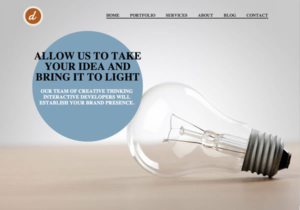
At this point you should have a site that looks similar to this.

You should have a full-screen background image that changes in size to match the viewers screen resolution, a main navigation bar, and a little blurb that will grab the attention of the viewer and encourage them to keep exploring the site. One of the best ways to encourage a viewer to continue exploring is by putting some of your best work on the home page for them to see. Once you’ve captured their interest with those they’ll continue to click through to other pages.
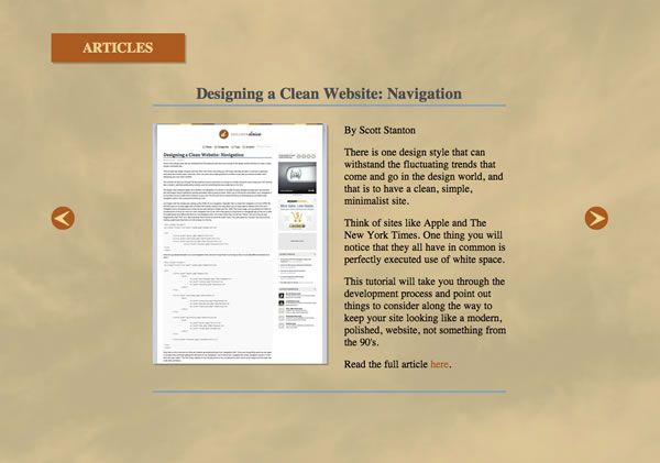
We’re going to use a jQuery slider to display our mini-portfolio on our homepage, just below the main screen. Because this is quite a big step, we’re going to break it down between two tutorials. First we’ll set up the HTML, and structure the content for our main screen, then we’ll plug in the jQuery and make our slider responsive. Go ahead and check out the image below to see what your finished product will look like.

Let’s begin in our index.php file. After we’ve closed off our “mainBG” div we are going to want to open up another div tag for our second screen that will contain our portfolio slider, I simply named my “mainBG2”. Next we’re going to want to put in another instance of our “container” id so that we can keep our content centered on the page. Then I included the “Articles” box section header that’s in the top left. Starting just under the closing tag for the “mainBG” div, my code looks as follows.
<div id="mainBG2" class="homeContent" data-type="background">

    	<div id="container">

        	<div class="articlesHeader">Articles</div>

	    </div><!--end div "container"-->

    </div><!--end div "mainBG2"-->
Once the basic structure of our secondary portfolio screen is set up, we can add in the HTML structure we’ll need for our portfolio slider. You’re free to populate this with what ever content is relevant to you, I’m just going to use a couple previous articles I’ve written. As you can see we’re able to include images and text. You’ll want to place this after our “articlesHeader” class, but before the close of our “container” div.
<div class="slider-wrap">
	<div id="slider1" class="csw">
		<div class="panelContainer">

			<div class="panel" title="Panel 1">
				<div class="wrapper">
					<h3>A Look At Responsive Web Design</h3>
                    <img src="images/responsive.jpg" />
                    <div class="hideSmall"><img src="images/responsivesmall.jpg" /></div>
					<p>By Scott Stanton</p>
					<p>Responsive web design is widely thought of as a design trend, but it's much more than that.</p>
					<p>It is an approach to web development that allows a website to break itself down smoothly across multiple monitor sizes, screen resolutions, and platforms, be it a computer, tablet or mobile device.  It allows the developer to create a site that is optimized for each platform, both in navigation, readability and load time.</p>
                    <p>In this tutorial, we take a look at what responsive web design entails for the developer.</p>
                    <p>Read the full article <a href="http://www.developerdrive.com/2011/12/a-look-at-responsive-web-design/" target="_blank">here</a>.</p>
                    <hr />
				</div>
			</div>
			<div class="panel" title="Panel 2">
				<div class="wrapper">
					<h3>Designing a Clean Website: Navigation</h3>
                    <img src="images/clean1.jpg" />
                    <div class="hideSmall"><img src="images/clean1small.jpg" /></div>
					<p>By Scott Stanton</p>
					<p>There is one design style that can withstand the fluctuating trends that come and go in the design world, and that is to have a clean, simple, minimalist site.</p>
					<p>Think of sites like Apple and The New York Times. One thing you will notice that they all have in common is perfectly executed use of white space.</p>
                    <p>This tutorial will take you through the development process and point out things to consider along the way to keep your site looking like a modern, polished, website, not something from the 90's.</p>
                    <p>Read the full article <a href="http://www.developerdrive.com/2011/11/designing-a-clean-website-navigation/" target="_blank">here</a>.</p>
                    <hr />
				</div>
			</div>

		</div><!-- .panelContainer -->
	</div><!-- #slider1 -->
</div><!-- .slider-wrap -->
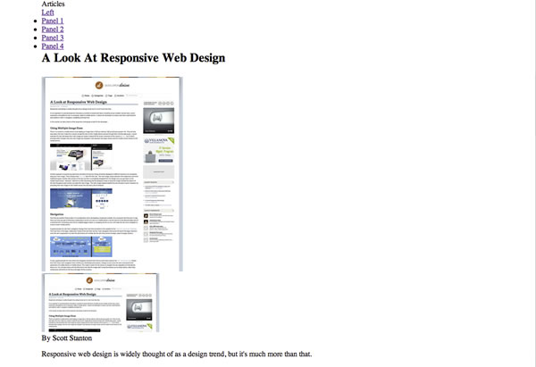
At this point if you save and preview your work, then scroll down below your main homepage screen, you should see something similar to this, depending on the content you entered.
The reason for this is because we haven’t entered the CSS to style our portfolio the way we want it yet. So, hop in to your “main.css” page and let’s do that now.
I used a h3 tag in the HTML of my portfolio to name what each slide was, since that’s near the top of my style sheet I’m going to apply that style first before I add in the new elements.
h3{
	font-size:1.7em;
	color:#474E51;
	border-bottom: 3px solid #6BA5BD;
	margin-bottom: 5%;
	padding-bottom: 3px;
	text-align: center;
}
With our h3 tag styled we can start to style our new elements, like #mainBG2 and .articlesHeader. For #mainBG2 we’re going to have a very similar style to #mainBG, only I added a top border to help separate it from our top image, and of course changed the image. The .articlesHeader class is pretty basic, I used a color that matched the logo for the box with a softer tan color for the text, and then applied a shadow to the box.
#mainBG2 {
	border-top:10px solid #EDEAE5;
	background: url(images/big2.jpg) no-repeat scroll;
	background-position:center;
	background-size: cover;
	-webkit-background-size: cover;
	-moz-background-size: cover;
	-o-background-size: cover;
}
.articlesHeader {
	margin-top:6%;
	width:24%;
	height:6%;
	background-color:#C15007;
	color:#FFD08C;
	font-size:1.5em;
	-webkit-box-shadow: 3px 3px 0px rgba(0,0,0,0.2);
    -moz-box-shadow: 3px 3px 0px rgba(0,0,0,0.2);
    box-shadow: 3px 3px 0px rgba(0,0,0,0.2);
	text-align:center;
	line-height:50px;
	text-transform:uppercase;
	font-weight:bold;
}
Now that the background image and the “Article” title box is in place we can style our slider HTML sections. Due to the large amount of code necessary to style our slider I have just placed notes in the CSS explaining what each tag does.
.slider-wrap { /* This helps position the side arrows vertically */
	margin: 2% 0;
	position: relative;
	width: 100%;
}
.stripViewer { /* This is the main viewing window */
	position: relative;
	overflow: hidden;
	margin: auto;
	width:675px;
	height: 70%;
	clear: both;
}

.stripViewer .panelContainer { /* This is the container housing all of our slides. Width is calculated and specified by the JS  */
	position: relative;
	left: 0; top: 0;
	width: 100%;
	list-style-type: none;
}

.stripViewer .panelContainer .panel { /* Each panel is arranged end-to-end */
	float:left;
	height: 100%;
	position: relative;
	width:675px;
}

.stripViewer .panelContainer .panel .wrapper { /* Wrapper to give some padding in the panels, without messing with existing panel width */
	padding:3% 5%;
}

.wrapper p, wrapper ul { /* The text inside each slide */
	font-size: 1.1em;
	line-height:1.2em;
}

.wrapper a { /* Any links inside each slide */
	text-decoration:none;
	color:#C15007;
}

.wrapper a:hover { /* Any links inside each slide */
	text-decoration:underline;
}

.wrapper img { /* Any image inside each slide */
	float:left;
	margin-right:5%;
	-webkit-box-shadow: 3px 3px 0px rgba(0,0,0,0.2);
    -moz-box-shadow: 3px 3px 0px rgba(0,0,0,0.2);
    box-shadow: 3px 3px 0px rgba(0,0,0,0.2);
}

.wrapper hr { /* Any horizontal rule inside each slide */
	height: 3px;
	background-color:#6BA5BD;
	border:0;
	margin-top:6%;
}
.stripNav ul { /* The auto-generated set of links, which I chose to hide */
	list-style: none;
}
/* These are tabs created by the java, I also chose to hide these */
.stripNav li.tab1 a { display:none; }
.stripNav li.tab2 a { display:none; }
.stripNav li.tab3 a { display:none; }
.stripNav li.tab4 a { display:none; }
.stripNav li.tab5 a { display:none; }

.stripNavL, .stripNavR { /* The left and right arrows */
	position: absolute;
	top: 230px;
	text-indent: -9000em;
}

.stripNavL a, .stripNavR a { /* The left and right arrows */
	display: block;
	height: 40px;
	width: 40px;
}

.stripNavL { /* The left and right arrows */
	position:absolute;
	left:0;
}

.stripNavR { /* The left and right arrows */
	position:absolute;
	right:0;
}

.stripNavL { /* The left and right arrows */
	background: url("images/arrow-left.png") no-repeat center;
}

.stripNavR { /* The left and right arrows */
	background: url("images/arrow-right.png") no-repeat center;
}
.hideSmall img { /* This is a smaller version of our main slider image that should only be displayed on mobile phones */
	display:none;
}
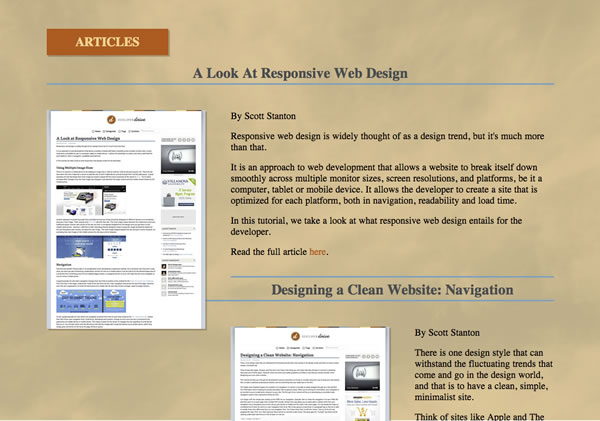
That does it for phase one of our mini-portfolio slider. If you check your work at this point you should have something that looks similar to this.

Be sure to check back for how to tie in the jQuery and make the slider responsive. If you’d like to download the full source code for our tutorial up to this point you may do so here.
