The CSS Grid Layout Module has quickly got traction among front-end developers. It’s a new web standard that allows us to create two-dimensional layouts with pure CSS. Imagine a grid system similar to Bootstrap or Foundation, that makes it possible to lay out web pages without using additional libraries or external grid systems. With the CSS Grid, we can lay out elements on the page along two axes—horizontally and vertically. In this article, we’ll look into how to create a CSS Grid step-by-step.
1. Set Up the Grid Container and the Grid Items
A CSS Grid consists of horizontal and vertical grid tracks (rows and columns). The grid tracks define the grid items (grid cells) that are easily identifiable by the row and column they belong to. The grid container is the HTML element that contains the whole CSS Grid.
To make an element into a grid container, we need to use either the display: grid; or the display: inline-grid; property. The former results in a block-level grid, while the latter leads to an inline-level grid.
A basic CSS Grid with three rows and three columns can be marked up with the following HTML code:
<div class="container">
  <div class="cell cell-1">1.</div>
  <div class="cell cell-2">2.</div>
  <div class="cell cell-3">3.</div>
  <div class="cell cell-4">4.</div>
  <div class="cell cell-5">5.</div>
  <div class="cell cell-6">6.</div>
  <div class="cell cell-7">7.</div>
  <div class="cell cell-8">8.</div>
  <div class="cell cell-9">9.</div>
</div>
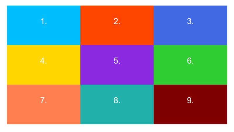
In the CSS, we use the display: grid; property on the .container element to create a block-level CSS Grid. The grid-template-rows and grid-template-columns properties define the number and size of the rows and columns in the grid.
In the code below, fr stands for the new fraction unit. It represents a fraction of the available space in the grid container. In our example, both the rows and columns are divided into 3 equal fractions.
.container {
  height: 90vh;
  margin: 2rem;
  display: grid;
  grid-template-columns: 1fr 1fr 1fr;
  grid-template-rows: 1fr 1fr 1fr;
}
.cell {
  color: white;
  font-size: 3rem;
  text-align: center;
  padding: 4rem;
}
.cell-1 {
  background: deepskyblue;
}
.cell-2 {
  background: orangered;
}
.cell-3 {
  background: royalblue;
}
.cell-4 {
  background: gold;
}
.cell-5 {
  background: blueviolet;
}
.cell-6 {
  background: limegreen;
}
.cell-7 {
  background: coral;
}
.cell-8 {
  background: lightseagreen;
}
.cell-9 {
  background: maroon;
}
This is how our CSS grid looks like in the browser now:
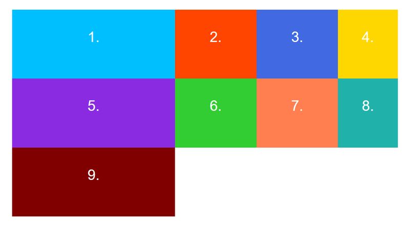
We can easily change both the size and the arrangement of the grid tracks by adding new values to the grid-template-columns and grid-template-rows properties. For instance:
.container {
  grid-template-columns: 2fr 1fr 1fr 200px;
  grid-template-rows: 1fr 1fr 1fr;
}
As there are 4 columns instead of 3 in the modified grid, the .cell-9 div can be found alone in the third row:
2. Add Gutters
The grid-gap property is a shorthand for grid-row-gap and grid-column-gap. We can use it to quickly add gaps in-between the grid tracks.
Let’s go back to the previous 3*3 grid and add a 10px gap between the grid cells. We can add the grid-gap property to the grid container in the following way:
.container {
  grid-gap: 10px 10px;
}
In the browser, we can see that now there is a neat gap in-between the grid cells:

3. Position Grid Cells
We can specify the size and location of individual grid cells using the grid-row and grid-column properties. We need to add these two properties to the grid cells we want to position.
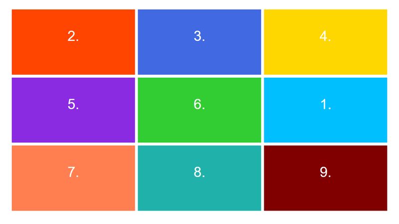
First, let’s see a simple case. Say we want to move Cell 1 to the second row and third column in the grid (to the current place of Cell 6). To do so, we simply need to add the following two CSS rules to .cell-1:
.cell-1 {
  grid-row: 2;
  grid-column: 3;
}
As you can see below, Cell 1 has been moved to the place we targeted and the rest of the cells keep following the default order:
4. Size Grid Cells
We can’t only use the grid-row and grid-column properties to change the order of the cells, but they also allow us to modify their size. In fact, both of them are shorthands. The grid-row property is a shorthand for grid-row-start and grid-row-end, while grid-column consists of the grid-column-start and grid-column-end properties.
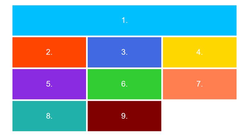
Let’s say, we want Cell 1 to span across the first row. We can implement the layout by adding the following style rules:
.cell-1 {
  grid-row: 1;
  grid-column: 1/4;
}
Below, you can see that Cell 1 spans across the whole first row and pushes down all the following cells:
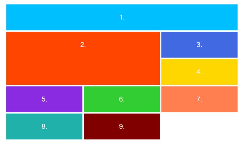
 The grid-row property works the same way as grid-column. Let’s say, we want to implement a more complicated layout and have a main content area beside the header (Cell 1). For instance, we can span Cell 2 across the first and second columns & the second and third rows using the following code:
.cell-2 {
  grid-row: 2/4;
  grid-column: 1/3;
}
And, the expanded main content area is already ready in the browser:
5. Define Named Grid Areas
In fact, it’s possible to implement any kind of complicated layouts with the CSS Grid. However, if our grid gets too complicated it can be tough to follow up with all the rows and columns by just referring them by their numbers. To help developers overcome this hardship, the CSS Grid also makes it possible to define pre-named grid areas that are easy to remember.
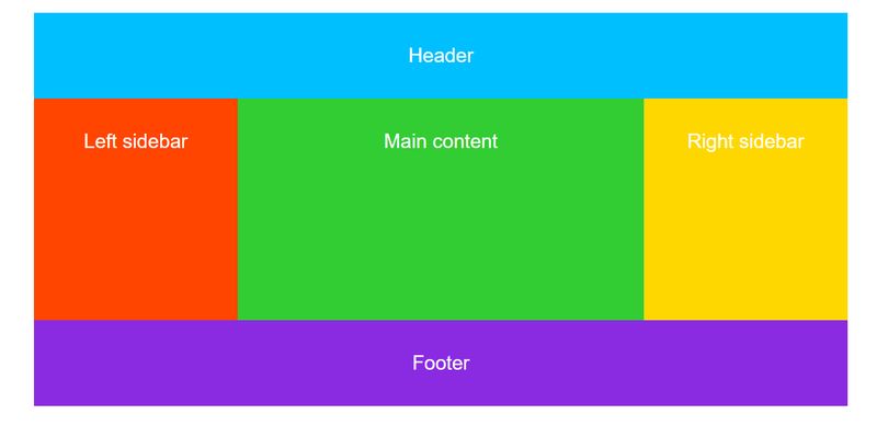
Let’s say we want to implement a simple blog page layout with a header, a footer, a main content area, and two sidebars (one on the left and one on the right side). Although this is not a very complicated layout, it can be still more comfortable to refer to the grid cells by their name.
The HTML is very similar to the previous example. We simply stack the cells on each other. However, for the sake of accessibility, here we use semantic HTML tags: header, main, aside, footer.
<div class="container">
  <header class="cell cell-1">Header</header>
  <aside class="cell cell-2">Left sidebar</aside>
  <main class="cell cell-3">Main content</main>
  <aside class="cell cell-4">Right sidebar</aside>
  <footer class="cell cell-5">Footer</footer>
</div>
In the CSS, we need to use two new properties: grid-template-areas on the grid container and grid-area on each individual grid area, separately.
First, let’s use the grid-area property on the grid cells and give each one a separate name. In the example, we use “header”, “left”, “main”, “right”, and “footer” names, but you can use anything else instead.
Then, we can add the grid-template-areas property to the grid container. It’s a really handy property, as it lets us arrange our grid cells visually. In our example, we want the main content area to be twice as wide as one sidebar. So, we specify one column to the left sidebar, one column to the main area, and one to the right sidebar.
As we want both the header and the footer to span across the whole screen, we specify three-three grid columns for each. We set the width and height of the rows and columns with the grid-template-rows and grid-template-columns properties, just like before:
.container {
   height: 90vh;
   width: 90vw;
   margin: 2rem auto;
   display: grid;
   grid-template-areas: "header header header"
                        "left main right"
                        "footer footer footer";
   grid-template-rows: 1fr 3fr 1fr;
   grid-template-columns: 1fr 2fr 1fr;
}
.cell-1 {
   background: deepskyblue;
   grid-area: header;
}
.cell-2 {
   background: orangered;
   grid-area: left;
}
.cell-3 {
   background: limegreen;
   grid-area: main;
}
.cell-4 {
   background: gold;
   grid-area: right;
}
.cell-5 {
   background: blueviolet;
   grid-area: footer;
}
.cell {
   color: white;
   font-size: 2.5rem;
   text-align: center;
   padding: 4rem;
}
As you can see on the screenshot below, the grid-template-areas and grid-area properties have automatically generated the grid we wanted to create:
6. Create Nested Grids
As the grid layout only applies to the direct children of the grid container, lower-level descendants won’t be grid items. However in many cases, we may want those elements to be grid cells as well. Luckily, the CSS Grid Layout Module module allows grid items to be grid containers as well. Nested grids work according to the same rules as standalone ones.
For instance, let’s say we want to divide the footer into four equal columns. In the HTML, we simply add four divs to the footer in the following way:
<div class="container">
   <header class="cell cell-1">Header</header>
   <aside class="cell cell-2">Left sidebar</aside>
   <main class="cell cell-3">Main content</main>
   <aside class="cell cell-4">Right sidebar</aside>
   <footer class="cell cell-5">
       <div class="cell cell-6">Footer 1</div>
       <div class="cell cell-7">Footer 2</div>
       <div class="cell cell-8">Footer 3</div>
       <div class="cell cell-9">Footer 4</div>
   </footer>
 </div>
In the CSS, we add the display: grid; property to .cell-5 and set the width of the columns and the column gaps using the grid-template-columns and grid-column-gap properties:
.cell-5 {
   display: grid;
   grid-template-columns: 1fr 1fr 1fr 1fr;
   grid-column-gap: 1rem;
}
.cell-5 .cell {
   background-color: coral;
}
If you check out the example in the browser, you can see that the footer has been divided into four equal columns indeed:
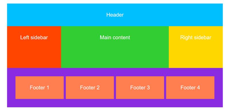 The nesting feature makes web developers capable to use the CSS Grid in real-life layouts where nesting frequently happens on several different levels.
Next Steps
As browser support for the CSS Grid has improved a lot in the recent year, you can begin to safely use it in web development. To learn more about CSS development, check out our recent guide on the best front-end development resources—many of them are related to the CSS Grid. And, if you still prefer to use front-end frameworks instead of CSS Grid we also have a great collection of the best ones on the market.
To stay updated with the latest news about web development and CSS, also don’t hesitate to follow us on Facebook and/or Twitter.