CSS3 introduced a novel concept, the ability to specify multiple, layered background images. This allows you to build up an image using smaller parts to create a more complex image. This feature allows you to have one single element instead of one for each image, it also means you don’t have to worry about z-indexing as it is automatic.
In this tutorial we’ll be creating an animated header using layered background images. We’re going to then apply an animation to position everything and add some interactive elements to finish it off.
Getting Started
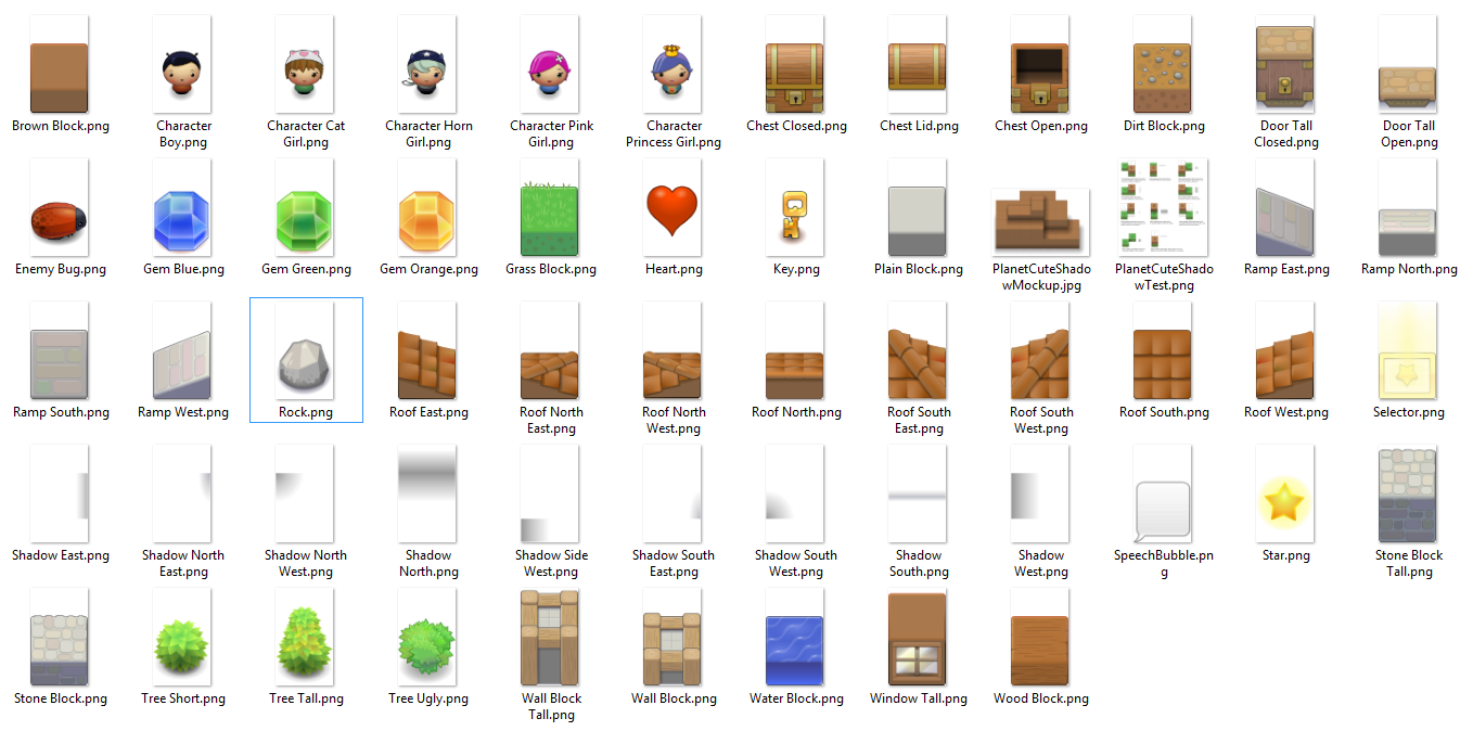
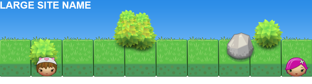
The first thing we need to do is decide what we want the header to look like. I’ve dabbled in making a few games before and I came across the great PlanetCute image pack from Daniel Cook. This pack doesn’t come with a sky background, but I’ve included one that works well with it. As an aside, this is a great place to start off from if you’re interested in making your own game.
Here is the sample HTML we’ll be using
<!DOCTYPE html>
<html lang="en">
<head>
    <meta http-equiv="content-type" content="text/html; charset=utf-8">
    <title>CSS3 Loading</title>
    <meta name="viewport" content="width=device-width, initial-scale=1">

    <style>

        body {
            margin: 0;
            padding: 0;
        }

        header#main {
            width: 100%;
            height: 250px;
            overflow: hidden;
            position: relative;
        }

        header#main h1 {
            color: #ffffff;
            font-family: Arial, Helvetica, sans-serif;
            margin: 0px;
        }

    </style>
</head>
<body>
    <div id="page">
        <header id="main" class="animation">
            <h1>LARGE SITE NAME</h1>
        </header>
    </div>
</body>
</html>
Building up our background
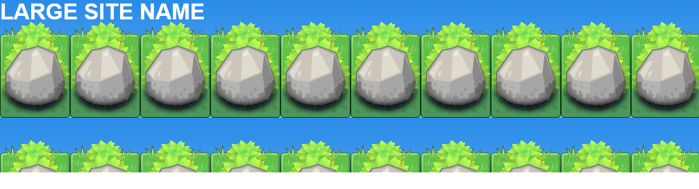
To actually create our multiple background images, we first need to consider the sequence of the images. The sequence is what implies the z-index the images are shown in. So for this example, since the sky is in the background, it will be the last image we apply. I’m also going to add in some grass, trees and a rock to make the image more interesting.
header#main {
    background-image: url('Rock.png'), url('Tree Short.png'), url('Tree Short.png'), url('Tree Tall.png'), url('Tree Tall.png'), url('Grass Block.png'), url('Sky.png');
}
Positioning
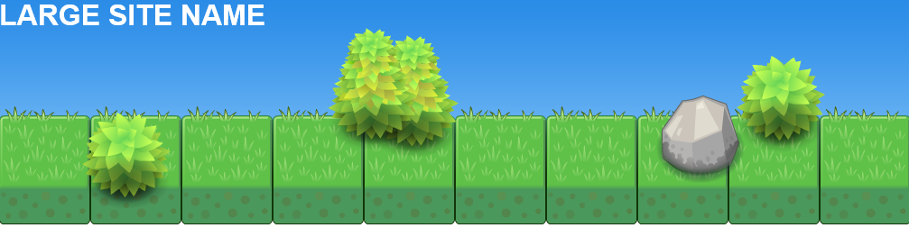
Next up, I want to position and make sure that only the sky and grass images are repeated. I do this by following the same order for the background-position and background-repeat properties. I could include each of these properties in a single background property, but I find that can lead to some very long and confusing CSS.
header#main {
    background-image: url('Rock.png'), url('Tree Short.png'), url('Tree Short.png'), url('Tree Tall.png'), url('Tree Tall.png'), url('Grass Block.png'), url('Sky.png');
    background-position: 80% 50%, 90% 10%, 10% 90%, 40% top, 45% 10%, left bottom, left top;
    background-repeat: no-repeat, no-repeat, no-repeat, no-repeat, no-repeat, repeat-x, repeat-x;
}
Adding Animation
Having all of the elements already in position is a little boring, so we’re also going add an animation to move them into position. To do this we’re going to use the @keyframes rule and specify 2 frames. Here you can specify either percentages or ‘from’ and ‘to’ values. I’ve gone with percentages in case you want to add more steps to your animation. Since not all browsers full support the generic @keyframes rule, we’re also going to have to specify the -webkit and -moz alternatives.
@-webkit-keyframes move {
    0% {
        background-position: 0 0, 0 0, 0 0, 0 0, 0 0, left bottom, left top;
    }
    100% {
        background-position: 80% 50%, 90% 10%, 10% 90%, 40% top, 45% 10%, left bottom, left top;
    }
}

@-moz-keyframes move {
    0% {
        background-position: 0 0, 0 0, 0 0, 0 0, 0 0, left bottom, left top;
    }
    100% {
        background-position: 80% 50%, 90% 10%, 10% 90%, 40% top, 45% 10%, left bottom, left top;
    }
}

@keyframes move {
    0% {
        background-position: 0 0, 0 0, 0 0, 0 0, 0 0, left bottom, left top;
    }
    100% {
        background-position: 80% 50%, 90% 10%, 10% 90%, 40% top, 45% 10%, left bottom, left top;
    }
}
Here you can see that I am giving everything but the sky and grass start positions of 0 0, this equates to top and left values. At the end of the animation, I expect the images to be in their final position. Now that we have our animation, we need to apply it. To do this, we simply specify the animation property on our header#main class (and the browser specific variants). The animation property allows us to specify the name of the animation, the duration, the timing function and iteration count.
header#main {
    width: 100%;
    height: 250px;
    overflow: hidden;
    position: relative;
    background-image: url('Rock.png'), url('Tree Short.png'), url('Tree Short.png'), url('Tree Tall.png'), url('Tree Tall.png'), url('Grass Block.png'), url('Sky.png');
    background-position: 80% 50%, 90% 10%, 10% 90%, 40% top, 45% 10%, left bottom, left top;
    background-repeat: no-repeat, no-repeat, no-repeat, no-repeat, no-repeat, repeat-x, repeat-x;

    -webkit-animation: move 3s ease 1;
    -moz-animation: move 3s ease 1;
    animation: move 3s ease 1;
}
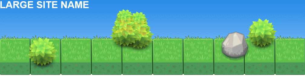
Now when you load the page, the trees and rock should move into position over 3 seconds.
Adding Interaction
To finish up the header, we’re also going to add to additional elements that will slide into position when the mouse moves over the header. I’ve picked two of the character images from the PlanetCute pack to show. Instead of adding them as multiple layers, this time we’re just going to add them as plain old img elements with specific classes. Our header HTML should now look something like this:
<header id="main" class="animation">
    <h1>LARGE SITE NAME</h1>
    <img class="character1" src="Character Pink Girl.png">
    <img class="character2" src="Character Cat Girl.png">
</header>
Initially I don’t want these images visible, so I’m going to position the absolutely and move them off screen. Next I’m going to specify a transition property for each of them. For the first, I’m limiting the transition to the left property and the second to the top property. For each transition I’m also going to specify different durations, but I’m going to use the same timing-function.
header#main img.character1{
    position: absolute;
    left: 110%;
    top: 50%;
    -webkit-transition: left 0.5s ease-in-out;
    -moz-transition: left 0.5s ease-in-out;
    -o-transition: left 0.5s ease-in-out;
    transition: left 0.5s ease-in-out;
}

header#main img.character2{
    position: absolute;
    left: 10%;
    top: 110%;
    -webkit-transition: top 1.5s ease-in-out;
    -moz-transition: top 1.5s ease-in-out;
    -o-transition: top 1.5s ease-in-out;
    transition: top 1.5s ease-in-out;
}
Finally to actually trigger the transition, we need to add a new class for each image that uses the :hover psuedo class. Then using the top or left (as appropriate) properties I set them to the position I want.
header#main:hover img.character1{
    left: 90%;
}

header#main:hover img.character2{
    top: 50%;
}
Now when the mouse hovers over the header, the 2 characters should slide in from the bottom and the side.

I had to re-upload the header.html here with some changes as WordPress replace the space some of the image names with a dash, so this is slightly different to what is available in the download below.
