Material design is a popular visual design system created by Google. It aims to enable designers and developers to create applications that have a unified look on all platforms. Apps that follow material design principles look beautiful and professional on all operating systems and devices. Google’s official material design toolkit supplies you with many assets such as guidelines, components, color palettes, themes, and icons.
However, that’s just the beginning. As material design is an open-source project, third-party developers have also created their own tools following material design principles. In this article, we have collected the best material design UI component libraries that can help you a lot in your next web or mobile app project.
Material Design Principles
Before getting started with the best material design UI component libraries, let’s have a quick glance at the most important material design principles. They are as follows:
- material color palettes typically use a primary and a secondary color,
- colors need to indicate the state of components and the relationship between them,
- text and icons should meet legibility standards,
- motion on the screen always needs to have a meaning,
- components should be reusable,
- icons should have clean folds and crisp edges,
- and many others.
Google made a thorough research to create the material design system and it takes some time to go through the guidelines. And, this is where the best material design UI component libraries can help you a lot. If you find one you like, you don’t have to be a material design expert to create apps that follow Google’s material guidelines.
The Best Material Design UI Component Libraries
Now, let’s see the best material design UI component libraries. Although you can use them for regular web development, too, they fit espcially well with Web Components and component-based JavaScript libraries such as React, Vue, Angular, and others.
1. Materialize
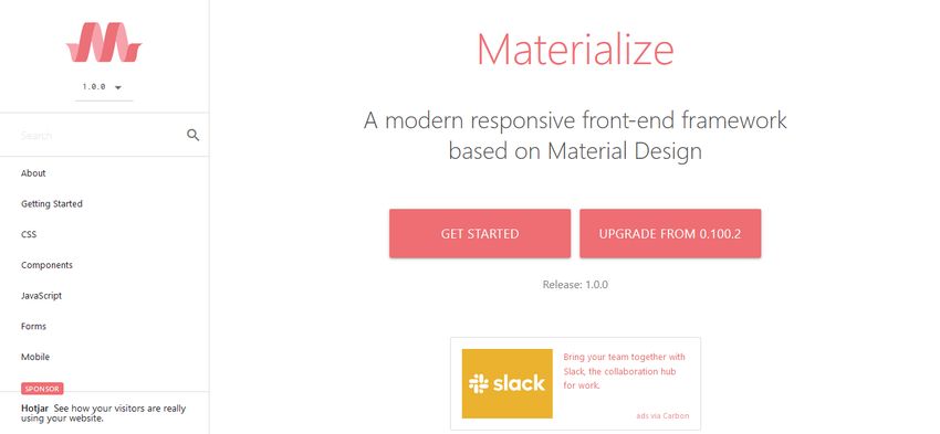
Materialize is a responsive CSS framework that follows the principles of material design. It provides you with multiple ready-to-use components such as badges, buttons, breadcrumbs, cards, icons, navigation bars, and more. Besides elements typical to websites, Materialize also includes mobile app components such as a cool drag-out menu and unobtrusive mobile alerts.
All Materialize components come with code examples you only need to add to your HTML page. Besides HTML and CSS components, you also get access to a number of customizable JavaScript elements such as a carousel, modals, parallax effects, and others. The team behind Materialize also offers themes that have been created with the component library, however they charge $19.00 – $49.00 per theme (or you can get the whole set for $59.99).
2. Material Design for Bootstrap
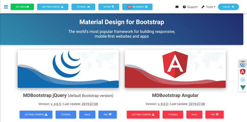
Material Design for Bootstrap is a versatile component library that allows you to build responsive, mobile-first websites and applications. It has been created for the Bootstrap 4 framework to help you use both front-end technologies at the same time. The default config uses jQuery for interactivity, however, the library also has setups for the three most popular JS frameworks: Angular, React, and Vue.
It has both a free and premium version. You can download the free material UI kit from GitHub. Currently, it includes 400+ material UI elements, 600+ material icons, 74 CSS animations, tutorials, and pre-made templates. Although the free library is more than enough for most apps, the pro version contains 4500+ premium components, 50+ premium sections, plugins, and JS modularity, too.
3. Material UI (for React)
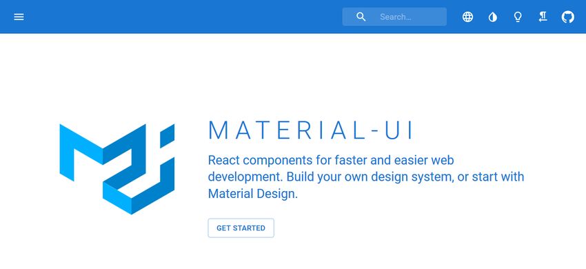
Material UI is a popular UI component library for the React framework. If you want to create any kind of React app with a material look and feel, you need not go further. The components of Material UI work out of the box, they don’t require any additional configuration. The library includes layout components, all kinds of input elements, navigation bars, surfaces, utilities, and more. For the full list of components, take a look at the documentation.
Besides having access to multiple pre-designed components, Material UI also provides you with an extensive Component API. It lets you customize all the components with the help of props and CSS customization points. Material UI’s docs are really good and easy-to-follow, with a lot of examples, code snippets, and demos, so you can quickly get started with prototyping.
4. Vue Material
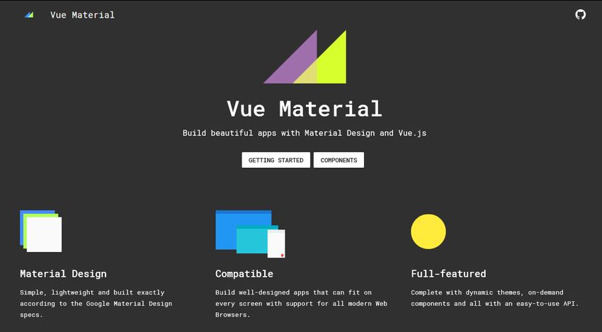
Vue Material is a lightweight material design UI component library for the Vue.js framework. Its creators take pride in having built all the components exactly according to Google’s material design specifications. Vue Material comes with tons of pre-designed UI elements such as avatars, buttons, cards, dialogs, forms, icons, lists, toolbars, and many more.
As Vue Material is pretty well-documented, it’s easy to get started with it if you worked with HTML, CSS, and Vue before. Each component is published within a live sandbox so that you can change the code online and see the results in real-time. Vue Material is a free UI component library that comes with two themes: Vue Material Dashboard Free including 16 components and the full-featured Vue Material Dashboard Pro for $59.00.
5. Angular Material
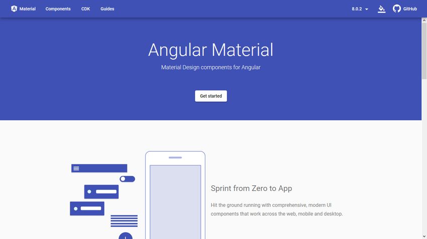
If you are on the look for a material design UI component library for your Angular application, Angular Material can be a good solution for you. It has been created by Google for the Angular 2 framework and it’s still under active development. Besides multiple UI components, Angular Material also includes the Angular Component Development Kit (CDK). Angular CDK is a toolkit that implements common interaction patterns such as accessibility, bi-directionality, drag-and-drop functionality, scrolling, and others.
Angular Material allows you to quickly prototype the user interface of any Angular application by providing you with professionally designed components created by Google. The components are categorized into six groups:
- form controls,
- navigation,
- layout,
- buttons & indicators,
- popups & modals,
- and data table for tabular data.
The library also comes with detailed guides that explain everything you need to know about building UIs with Angular Material.
6. MUI CSS
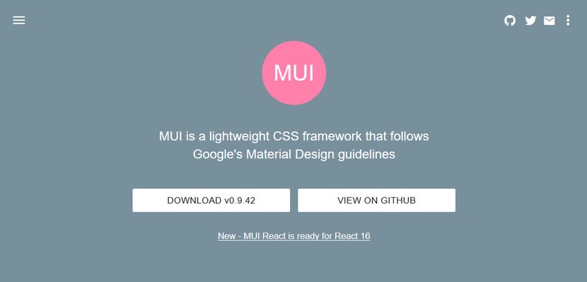
MUI CSS is a lightweight material design UI component library that includes the most important components you need in a website or application. You only need to add a minified CSS (6.6 kbyte) and JavaScript (5.4 kybte) file to your HTML page. As MUI CSS doesn’t have any external dependencies, it’s easy to set it up, even for beginners.
Besides components written in regular CSS and JS, MUI CSS has ready-to-use UI elements for React and Angular apps. The MUI CSS team has also begun to develop the beta version of a Web Components library, currently with three types of components: a HTML boilerplate, buttons, and forms. In addition, MUI CSS has a cool email UI library, too, with which you can create email templates that follow the material design guidelines.
7. Material Components for the Web
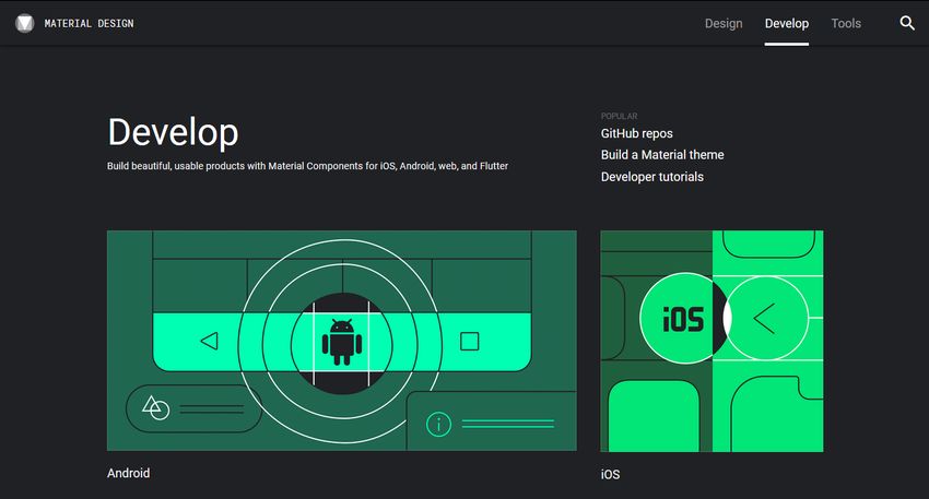
Material Components for the Web is the successor of Material Design Lite (MDL), both created by Google’s in-house team. Google’s documention on GitHub even refers the Material Components for the Web library as MDL v2. So, if you were thinking about using MDL for your project, use this library instead, as MDL vs1 is already in limited support mode.
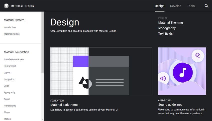
You can find Google’s Material Components on the same material.io website where Google hosts its material design guidelines mentioned above in the article. You get access to pre-designed material UI components for four platforms:
- Android,
- iOS,
- web,
- and Flutter.
The web library provides you with a wide range of UI components such as buttons, cards, grids, surfaces, menus, tabs, and many others. If you want to create a web or mobile app that looks like Google’s own applications, the Material Components for the Web library can be the best solution for you.
Conclusion
Material design can give a professional look and feel to any web or mobile application. It’s especially a good choice if you want to build apps for the same brand for different platforms.
Creating a good-looking UI can be quite a challenge. With the best material design UI component libraries, you can follow Google’s material design guidelines without being an experienced designer.
If you are a programmer who usually works with back-end languages but want to know more about how to use UI frameworks, check out or backend developer’s guide to UI design, too.