Ever noticed if you resize your browser window with Gmail open (or Asana or a host of other sites) the various elements on screen resize automatically in a smooth animation? This can be done using JavaScript or jQuery, but can also be achieved using CSS3 transitions and @media selectors.
Introduction to @media selectors
If you already have a responsive design you’ll probably be familiar with @media selectors. If you’re not familiar, they are essentially a way of applying specific CSS classes to different screen types and resolutions. This means you can have the same site and content tailored to look completely different on different screen sizes or devices. You can see a full list of the various condition properties here
@media only screen and (min-width: 480px) {
}
@media only screen and (min-width: 600px) {
}
@media only screen and (min-width: 768px) {
}
@media only screen and (min-width: 992px) {
}
@media only screen and (min-width: 1382px) {
}
I tend to use the 320 and up boilerplate by Andrew Doyle.
The 320 and up methodology is that by default you are designing for the smallest resolution (320px) and then building on it for each screen resolution above. I find this leads to much cleaner and maintainable CSS.
CSS3 Transitions
CSS3 Transitions change the behavior of a style or property change so that it becomes an animation. You can ‘width’ and whenever an element’s width is changed the animation will trigger for the specified duration. You can specify lots of other properties to animate, everything from width or height properties to background colors. If you’d like to learn more about transitions you can see a few of my tutorials here
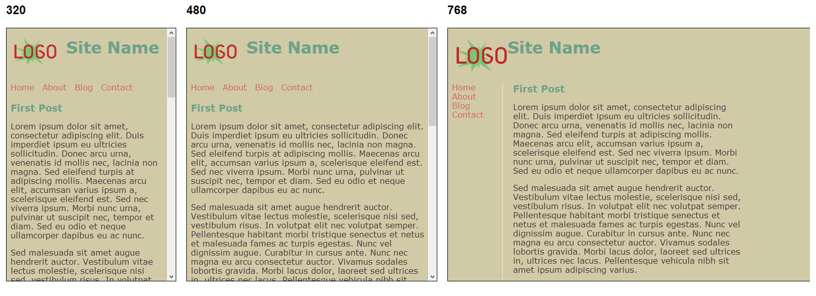
For this tutorial I’ve done up a simple home page. On larger resolutions it’s 2 columns, navigation on the left and content on the right with the header on top. Using media selectors, on smaller screens the navigation is on top and the content on the bottom. By applying the following CSS3 class, when the browser is resized the elements resize over the specified period of time (1 second for width and 1.5 seconds for left)
section, h1, li, img {
    -moz-transition: width 1s ease-in-out, left 1.5s ease-in-out;
    -webkit-transition: width 1s ease-in-out, left 1.5s ease-in-out;
    -moz-transition: width 1s ease-in-out, left 1.5s ease-in-out;
    -o-transition: width 1s ease-in-out, left 1.5s ease-in-out;
    transition: width 1s ease-in-out, left 1.5s ease-in-out;
}
You can see the demo page here, try resizing your browser window to see the different animations
For testing responsive designs I find Matt Kersleys Responsive Test tool invaluable
The full HTML and CSS can be downloaded below


